Music Festival Volunteer Portal
Information Architecture | Interaction Design | UX Design
BACKGROUND
Blissfest is an American roots music festival that takes place every summer in Michigan. The event only spans a few days in July, but the recruitment and organizing of volunteers starts many months in advance.
Since 2015, Mae, the owner of Beale Street Software, has provided Blissfest with access to and support for Festi, a volunteer management system she developed that’s geared towards nonprofit organizations.
The volunteer coordinator uses the system to create electronic signup forms, review and approve submissions, and manage volunteer schedules. On the volunteer side, the system is used to register as a festival volunteer, request their preferred work shifts, and view their shift assignments.
PROBLEM
Mae asked for my help in redesigning the Volunteer Self-Scheduling page in Festi. This was where registered volunteers come to request the shifts they want to work, before the submission is sent to the coordinator for final approval.
The page “worked” functionally, but had several things going against it:
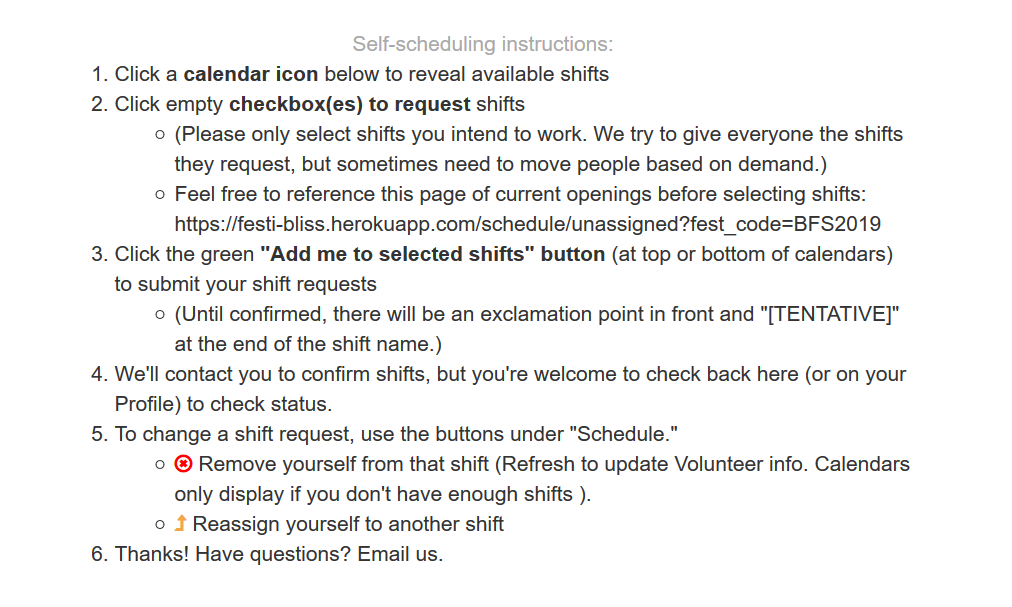
The list of instructions was far too long. The page also lacked calls to action on what users should do next.
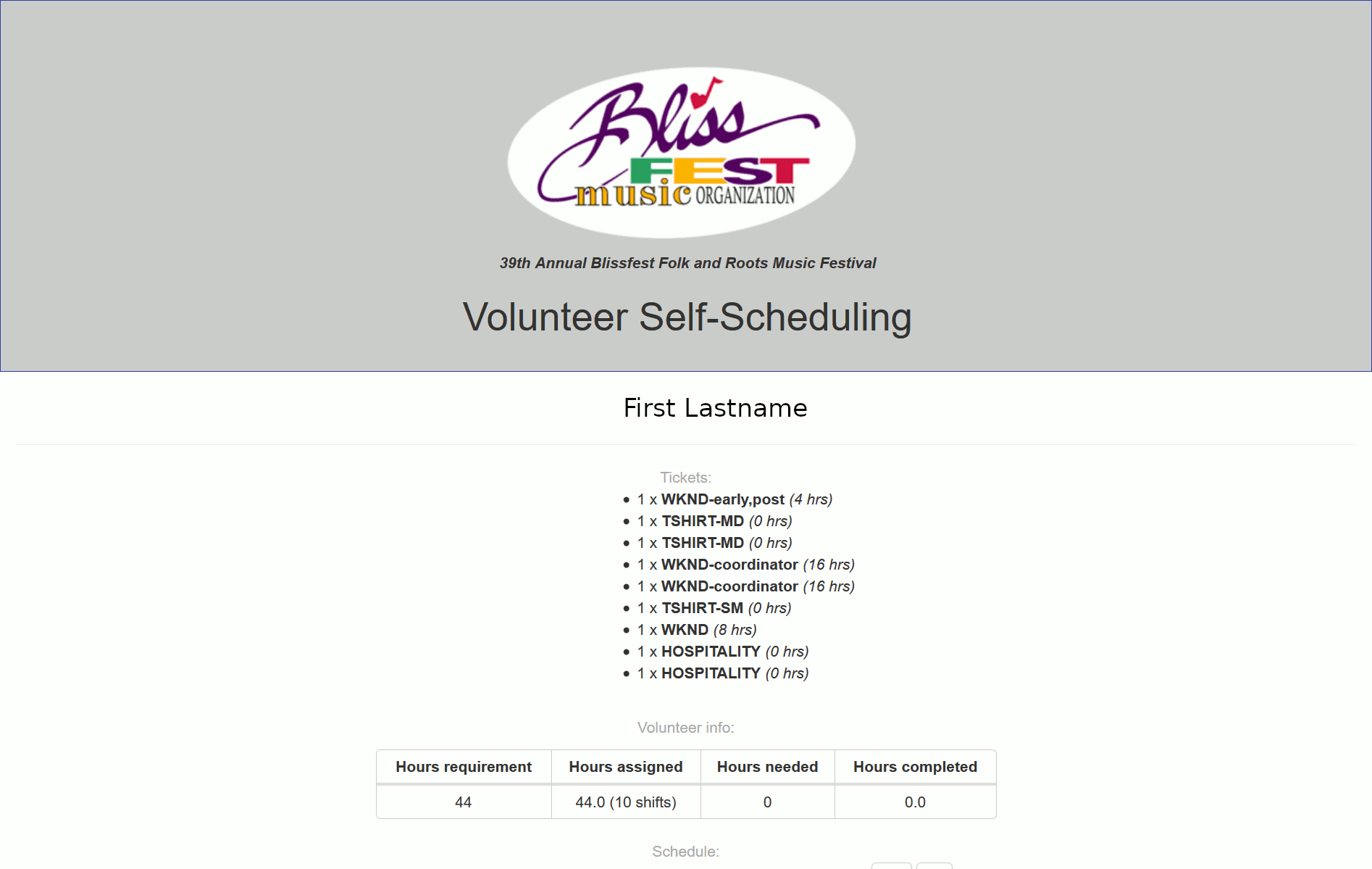
The page was lengthy and lacking a clear visual hierarchy.
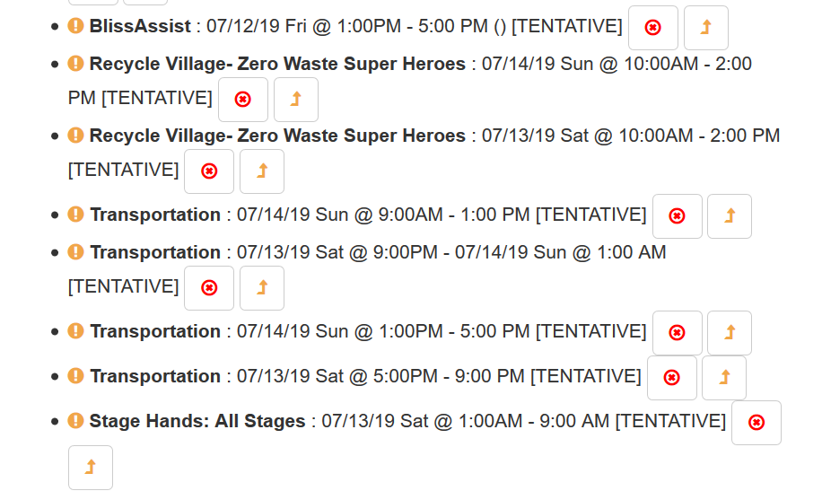
The page lacked intuitive headers and labels. Users had to rely on the long list of instructions to complete their required tasks.
more intuitive
more streamlined
easier to follow
USERS & AUDIENCE
The users of the Volunteer Self-Scheduling page include every person who has already completed volunteer registration.
1200
Registered Volunteers
30
Unique Teams
46
Average Age
75
% are returning volunteers
ROLES & RESPONSIBILITIES
My role was UX/UI consultant, where I performed all of the UX research, brainstormed and shared ideas, presented concepts and solutions, and worked with Mae and the client to gather and implement feedback.
Mae was the developer for the project. She also provided insight from her previous experiences working with Blissfest.
We set up regular calls (usually weekly, sometimes more spaced out) to discuss progress, as well as used Slack, email, and face-to-face meetings whenever Mae was in town.
We also worked remotely with the Blissfest Director of Volunteering, Caroline, who was also the volunteer coordinator and our primary stakeholder.
SCOPE & CONSTRAINTS
The scope of the project started off initially small, focusing on the Volunteer Self-Scheduling page. We began discussions in February 2019.
Although we didn’t have a set deadline for completion of the whole project, we set weekly milestones and aimed to implement as many improvements as possible during this festival season.
As our meetings continued, we decided to expand the scope to the entire Festi volunteer experience, instead of just the Self-Scheduling page.
WHAT I DID
Strategy
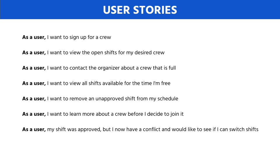
Determining User Stories
After consulting with Mae, I identified several user stories that the Self-Scheduling page should enable users to complete. These were fine-tuned as the project continued.
Research + Analysis
Set Off to Do Some Research
I looked at various volunteer management-related systems, plugins, and templates. I also looked into Ticketmaster and other sites that are based around events.
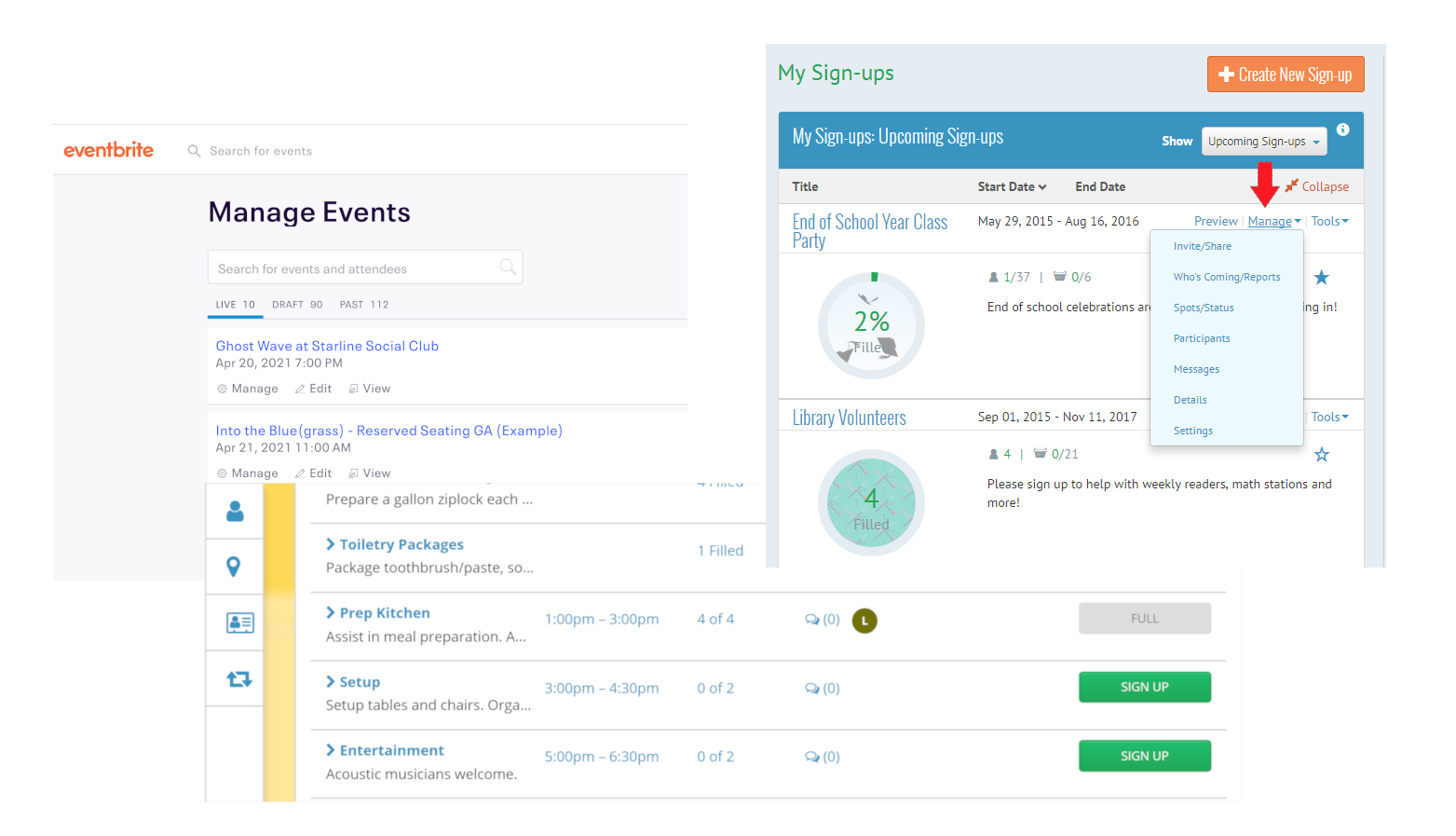
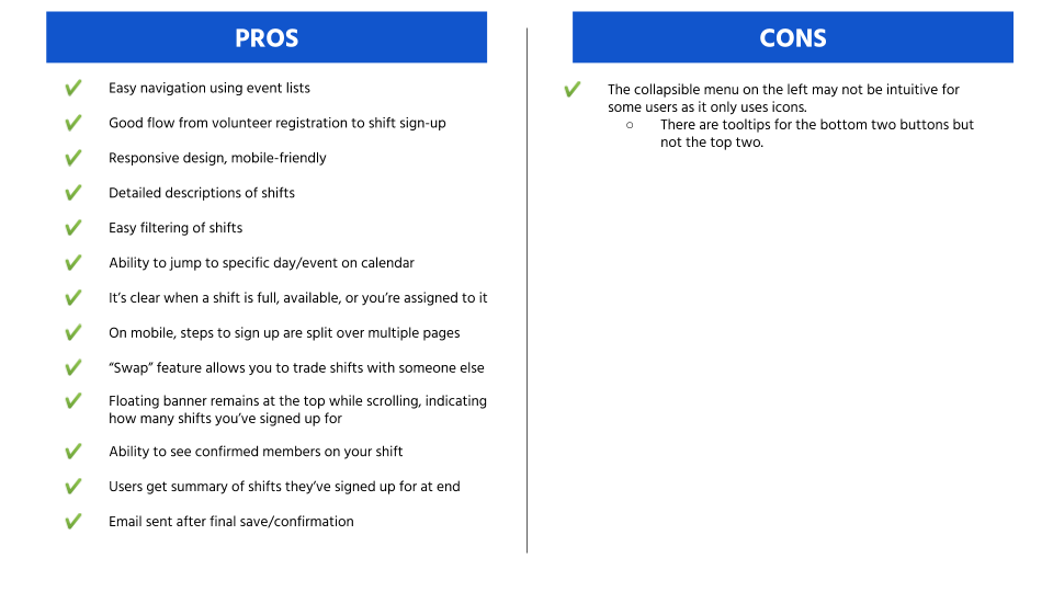
My Biggest Inspiration Came From Signup.com
During my research, I found that signup.com hit many of the marks we were going for. While viewing a demo account, I created a list of pros and cons as they relate to the goals of our users.
Aside from a couple minor issues, the process they had was pretty seamless and straightforward – exactly how we wanted ours to be.
Performing a SWOT Analysis
I also conducted a formal review of the Blissfest Volunteer Self-Scheduling page in order to create a SWOT (Strengths, Weaknesses, Obstacles, Threats) analysis. This helped us to clearly identify where our system stood and what could potentially impact the success of our system revamp.
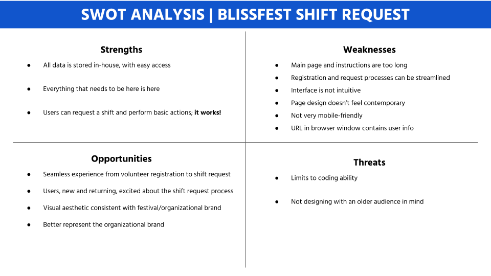
As you can see, while there were several weaknesses noted in regards to the current page, there were few threats and many opportunities to make this the product our users needed.
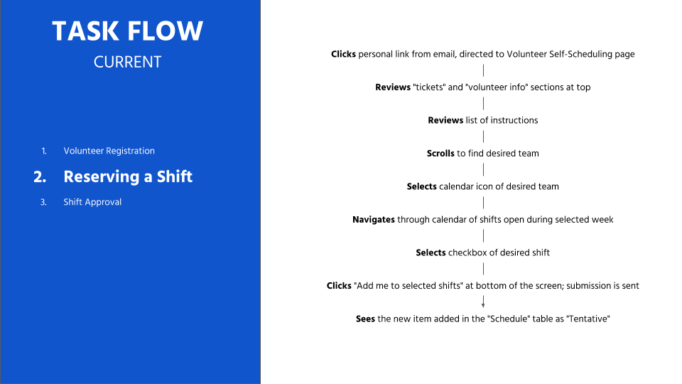
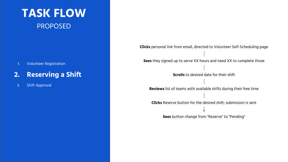
Mapping Out the Flow
I wrote out the task flow that volunteers currently followed to go from volunteer registration to shift request, and then created a proposed version with simplified steps. I started from volunteer registration because while our focus was the Self-Scheduling page, I wanted to make sure I knew exactly how the flow of information was moving for registered users.
I met with Mae to discuss all of the work I’d done so far. As someone who was usually thinking and working on projects by herself, she was thrilled and felt she was learning a lot in the process.
Design
Putting Pencil to Paper
I sketched a few ideas to represent how users could complete the different use cases we identified earlier.
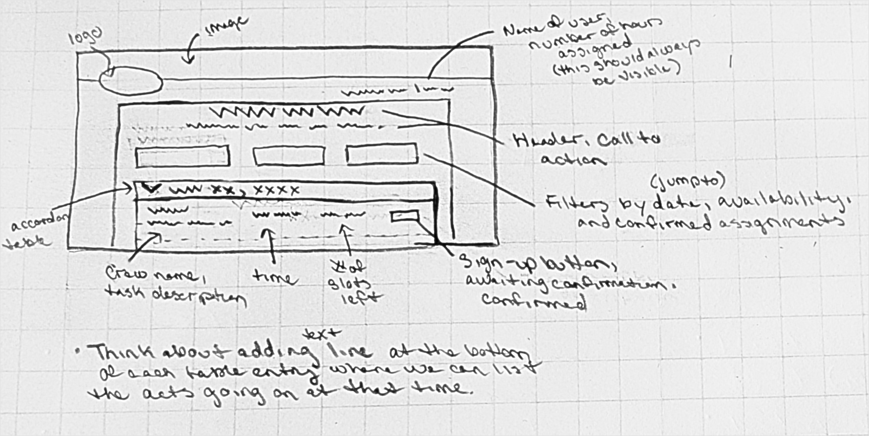
Creating Wireframes
I used the sketches to jumpstart my next step – creating wireframes in Adobe XD. Some highlights of the things I included were:
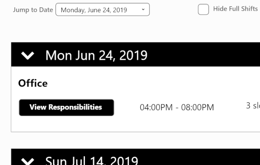
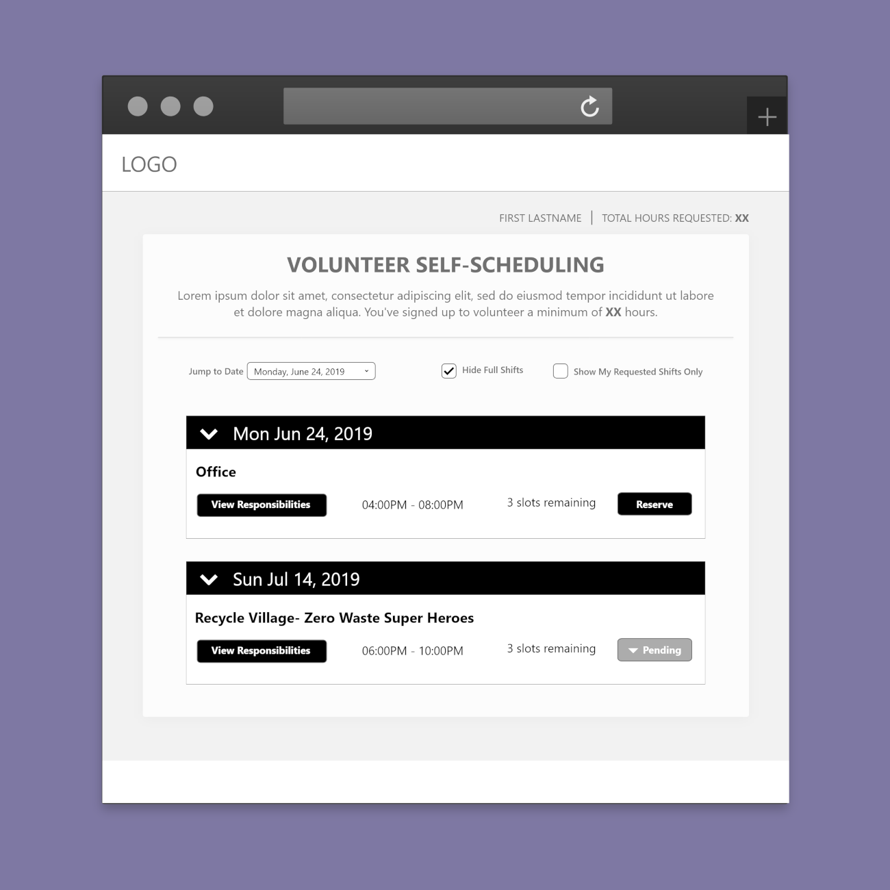
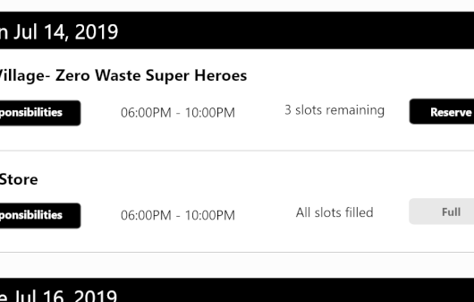
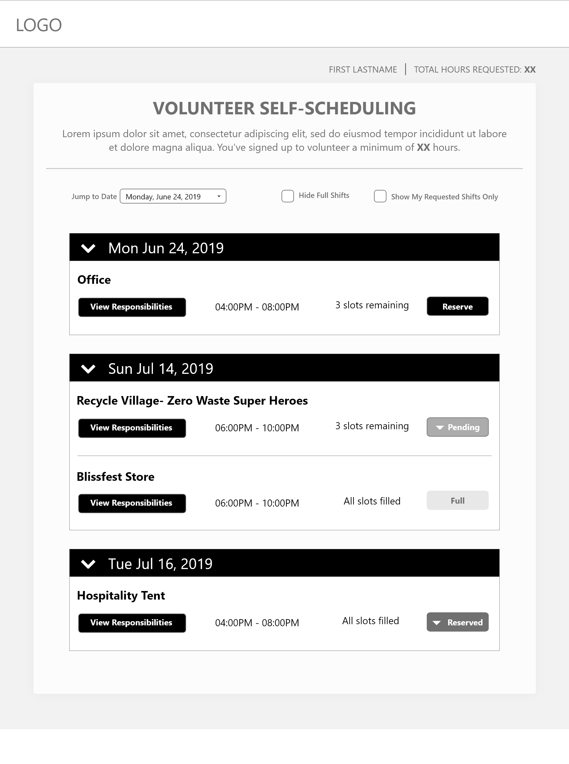
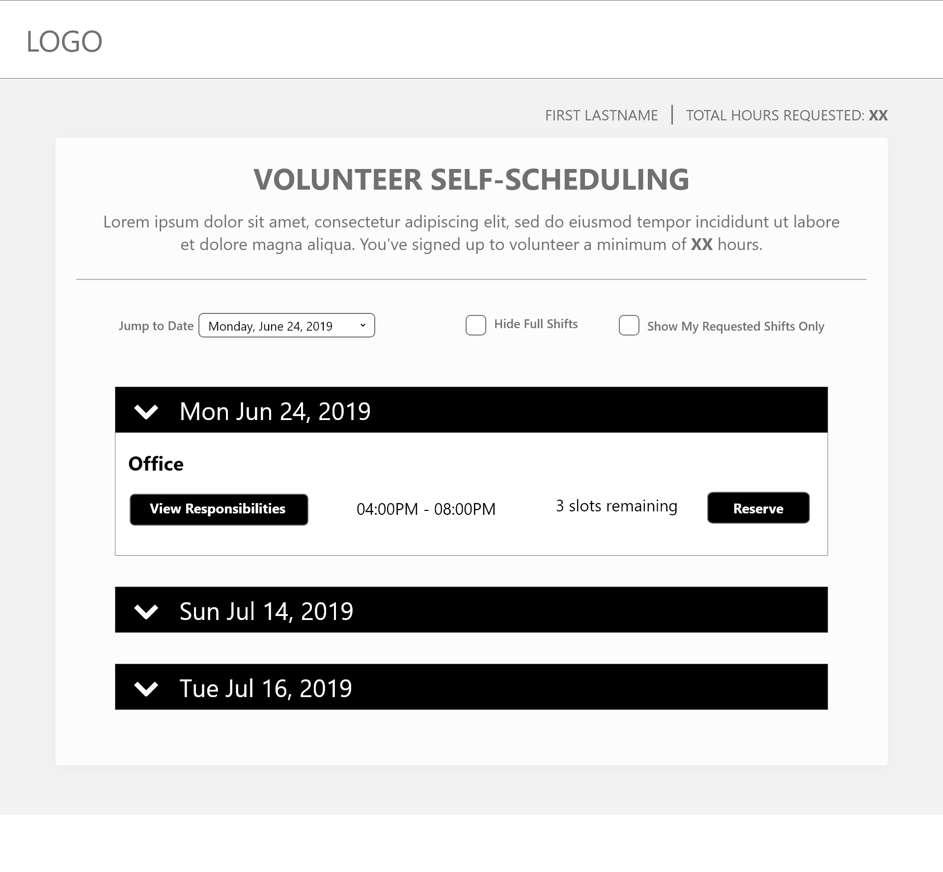
During an interview with the stakeholder, I learned that most people come in knowing on which date they want to volunteer. To make things easier, I grouped the available shifts by date instead of by team. Users can also jump to a specific date.
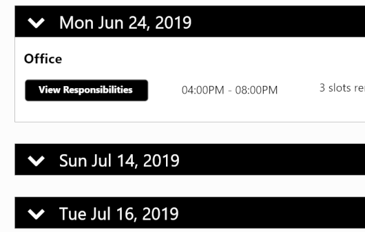
I also made each grouping block collapsible. One of the main problems with the old interface was that the page was too long, requiring a lot of scrolling and showing too much at one time. By making the groups collapsible, we take up less screen real estate and make it easier to scan for important information.
In the old interface, the calendar view was a bit confusing and not very intuitive. I addressed this by using clear language and putting relevant information front and center.
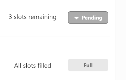
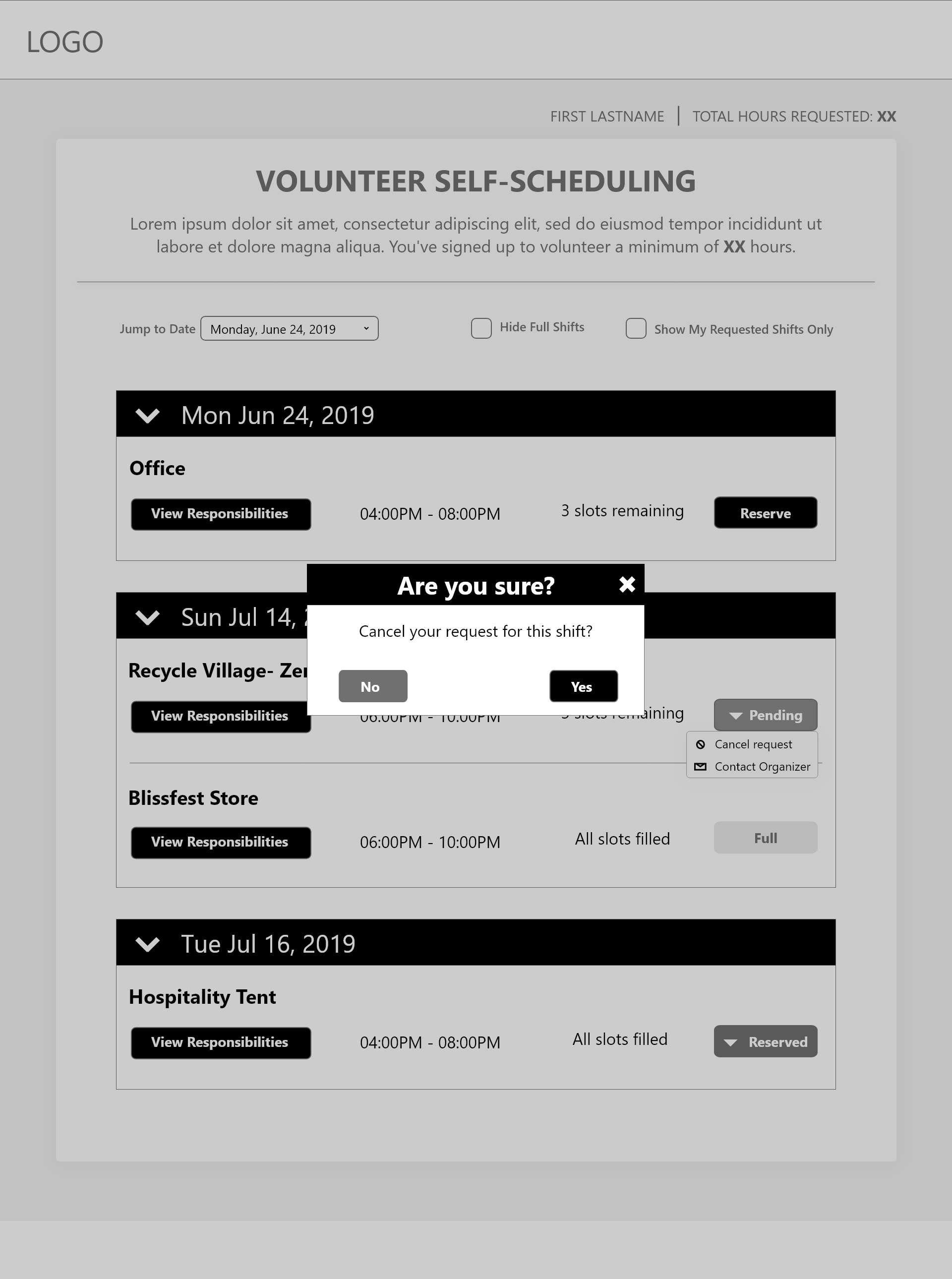
I took out the “Schedule” section that showed which shifts the user requested/reserved. Instead I added a button that changes between “Reserve”, “Pending”, and “Reserved”. This allows us to save real estate and gives an easy visual indicator on the status of that particular reservation request.
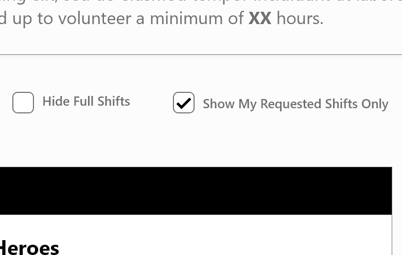
I added two filters: one to hide shifts that are completely full and the other to show only the shifts the user has requested or has gotten approval for.
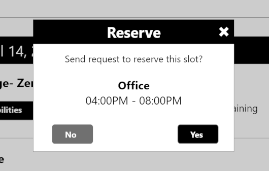
One major pain point from users was the lack of Call to Action after they submitted a reservation request. I address this by adding a dialog box (“Reserve”) that has the user accept or cancel the action to send the request, as well as a second dialog box (“Request Sent”) that confirms the request was sent and alerts the user of what they should expect next.

I uploaded the wireframes for Mae to view and comment on. Overall, she was very pleased with how everything came out. She also provided feedback on things that might work better for our audience, given her extensive time spent working with them.
NEXT STEPS
A New Realization
As Mae and I discussed the wireframes, one theme that stuck out was the need for a more unified, integrated experience for volunteers. As it stood,
- volunteer registration lived outside of a unified interface with the self-scheduling page
- long-time volunteers had to re-register every year, even though their profiles are saved
- Festi lacked a standardized communication system
Expanding Our Scope
When Mae first brought me on to this project, our focus was exclusively on the self-scheduling page. After some discussion, however, Mae and I decided to expand our focus to the entire volunteer experience with Festi.
This would require:
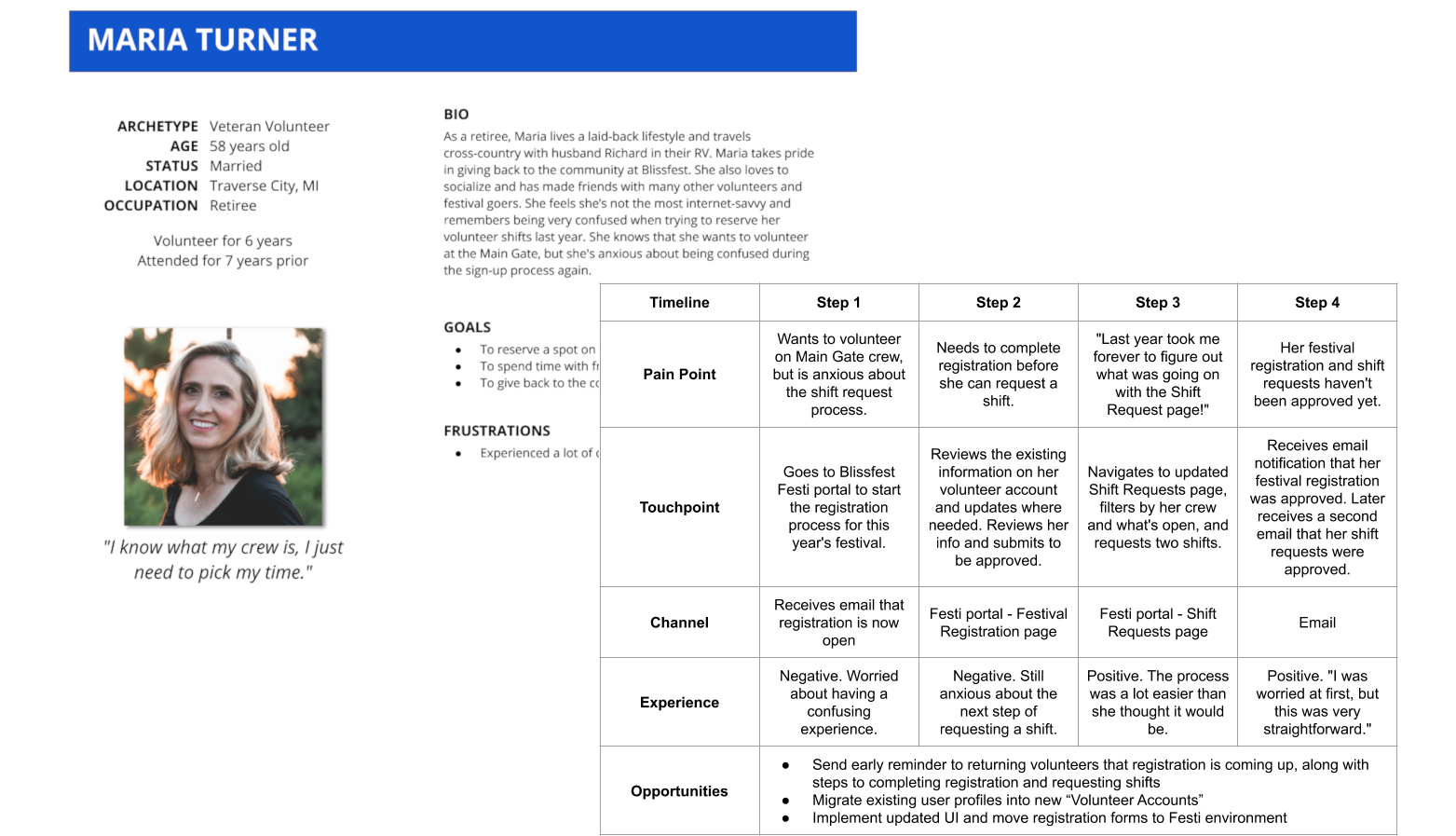
- more user research and user analysis (e.g. creating personas, journey maps, etc.)
- taking a closer look at the volunteer experience from a higher level
- redefining our user goals
This would also provide the opportunity to dive further into user testing and feedback.
This process is summed up in the second half of this case study, Part II: Rethinking the Volunteer Scheduling Experience — coming soon.